Every September, 40 000+ fans and visitors come to the KLM Open, the oldest golf tournament on the European Tour.
To keep all these visitors engaged over the four-day event, KLM Open strives each year to improve the live experience for fans by creating new engaging features to their mobile application.
For the 2017 edition of the tournament, IBM Interactive Experience (iX) created the ultimate golf app.
Project details
Client
TIG Sports / KLM
Platform
Hybrid app for iOS & Android
My role
Product Designer
The team
Back-end developers
Hardware engineer
Project manager
App developers
Timeline
July 2017 – September 2017
My responsibilities
As the Product Designer on the team, my main responsibility was to be the voice of the users throughout the design and development process.
My main tasks were to gather insights from previous learnings (this was the third version of the app), facilitate explorations, sketching, prototyping, and in the end, deliver final UI specs to the developers.
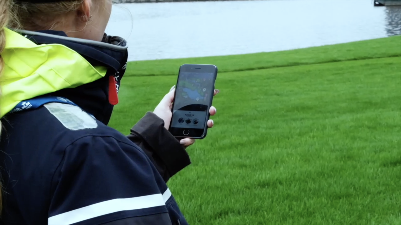
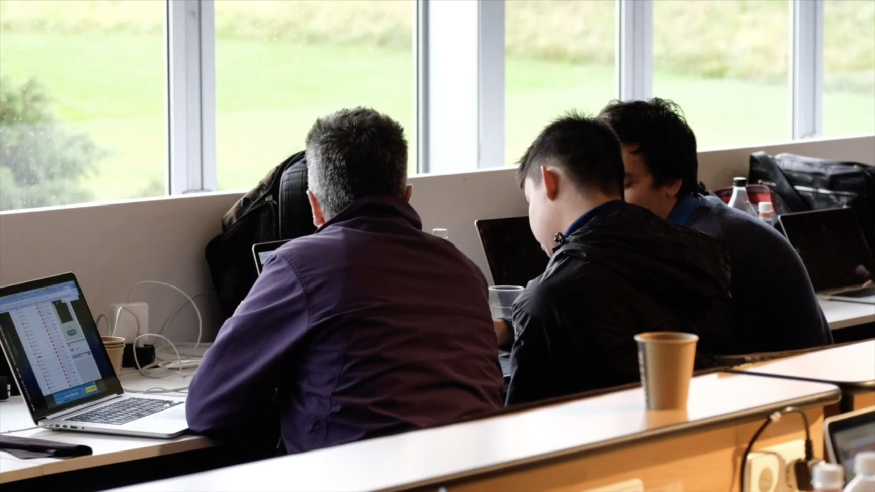
Once we got to the tournament, my focus was to observe, document, and talk with the users to gather insights for the upcoming versions of the app.
I also supported the dev team in any design-related issues that came up so we rapidly could make changes and update the app at the end of each day of the tournament.
The users
Who are we designing for?
The KLM Open app was designed primarily for the visitors coming to the golf course to view the tournament live. Many of these users had a general interest and understanding of golf, but we wanted to also design for visitors with less knowledge about golf so that they too could enjoy the tournament as well.
The problem
What was the main problem for the KLM Open visitors?
Because golf tournaments, in general, are very analog it is really hard for the visitors to know where the players are at any given time, unless they are walking along the course with the group from the start. So imagine you want to go and see another group of players on the course – how would you find them?
Challenges & Constraints
Physical challenges
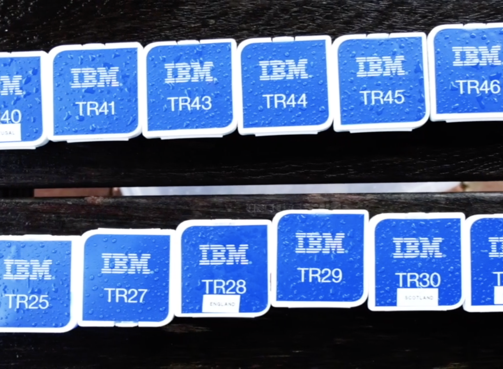
– 40+ trackers to be handed out & paired to the right group of golfers
– Huge area to cover
– Outdoors
– It was a live event, so everything had to work from the get-go
– Limited time for designing & building the app
Technical constraints
– Bad reception in some parts of the course
– The battery life of the GPS trackers was short, and if the trackers kept trying to establish a connection the battery would run out faster.
– The hybrid application meant making compromises in the design and build of the application
The Design Process
STEP 1
Gathering insights
The first thing I did was to read the notes & outcomes from the previous year to get a good understanding of what worked and what didn’t.
We then did a lot of competitive analysis to get an understanding of what expectations golf fans have of a golf app – scoring system, terminology, etc. It helped that I’m a huge golf nerd as well. 🙂
We then did some interviews with golf fans who regularly use similar golf applications or are familiar with attending golf tournaments.
The key learnings I got from this was:
– Focus on the core elements. The most important thing is that the scoring is on point and up to date.
– A good overview of the course and event area – “Where to go to see X or do Y?”.
– Users want to see where their favorite players are located.
STEP 2
Re-mapping the user journey
In all its simplicity the key learnings from the previous year and our interviews were: Less is more.
So this phase was all about stripping the solution of some functionalities and make sure the core features in the solution were great.
Key outcomes:
– Remove the previous year’s game feature.
– Make adjustments to the leaderboard functionality in order to make it more intuitive and easier to get an overview.
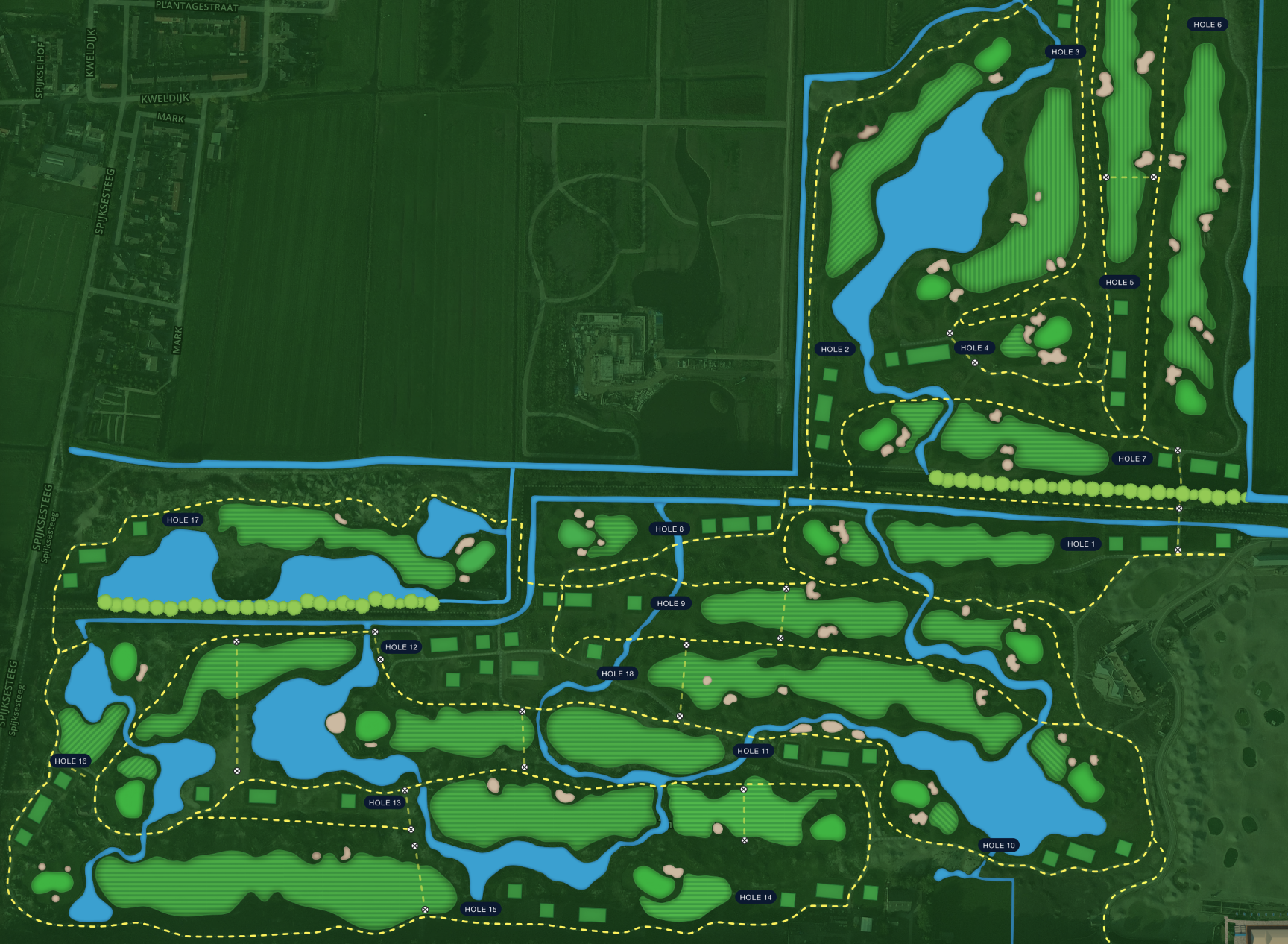
– Make the map and GPS feature more reliable and easy to use.
– Create a good course overview
STEP 3
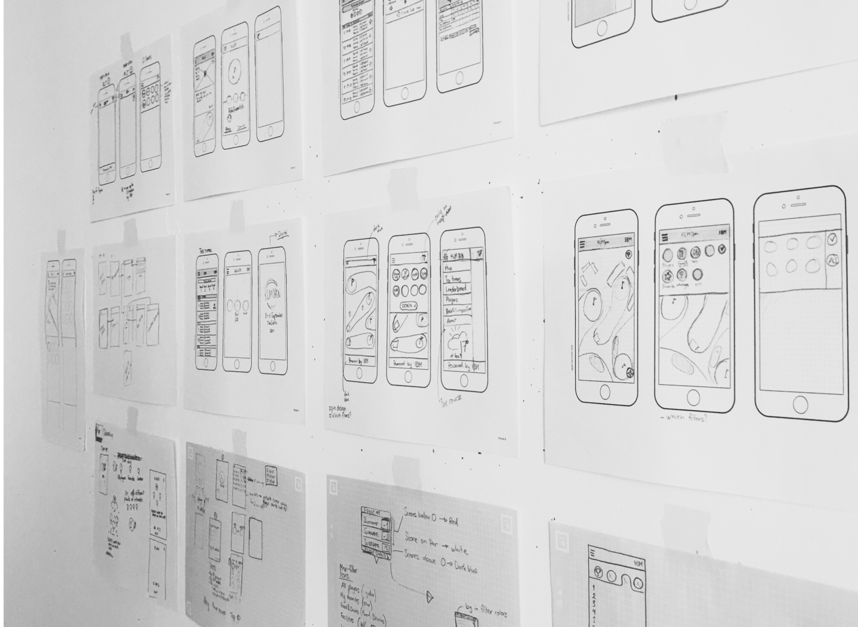
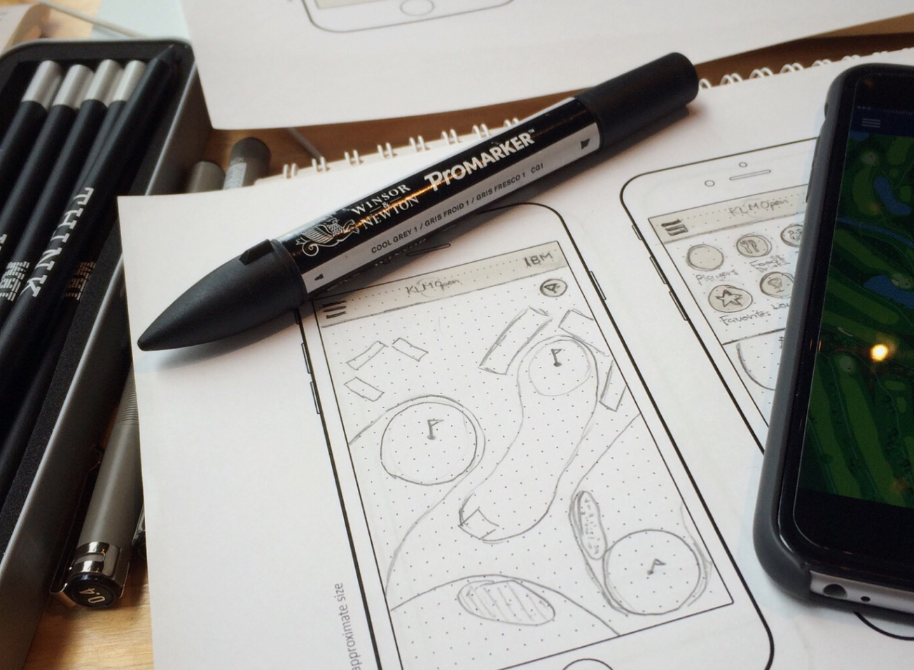
Sketching
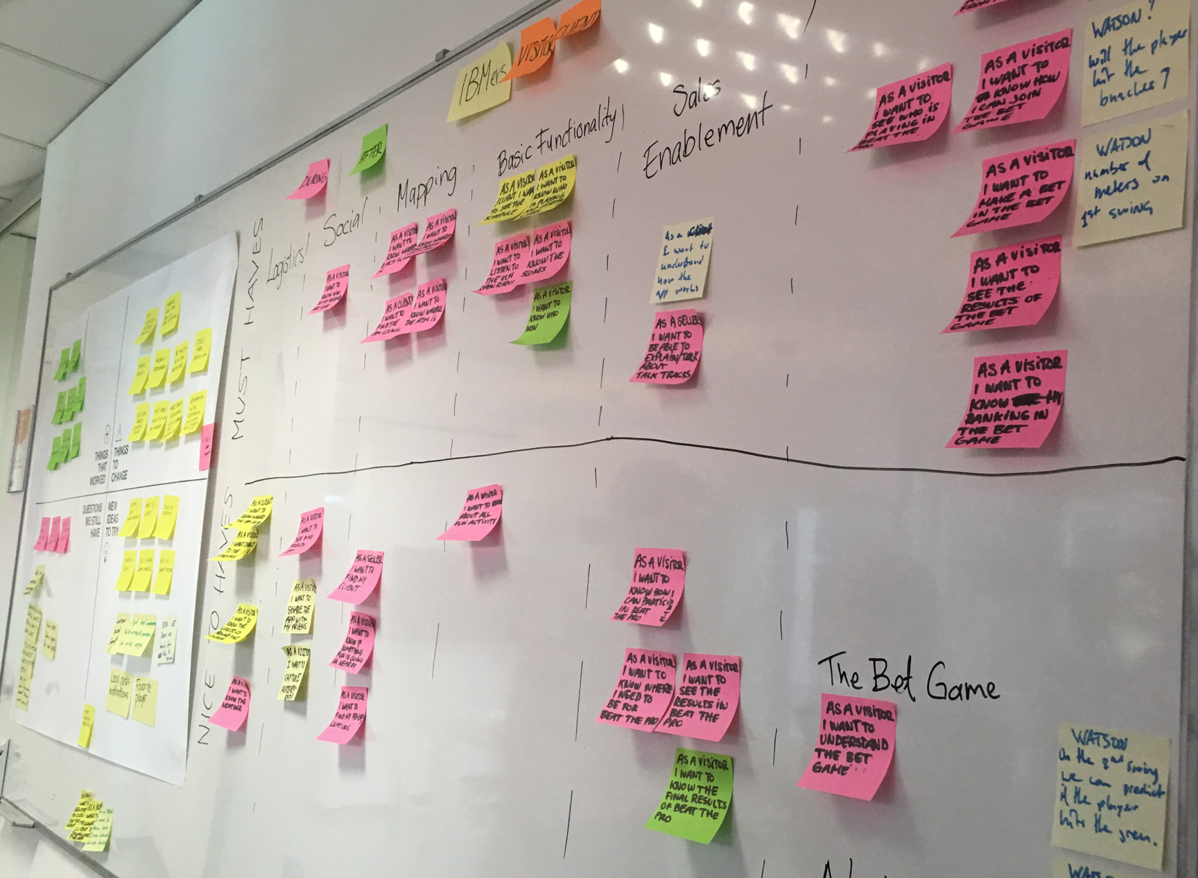
After deciding on what we needed to focus on in order to fulfill the user needs we started to sketch our ideas.
The main outcomes were:
– More spacing in the leaderboard to make it easier to comprehend at a glance
– Swipe functionality to swipe between the full leaderboard and your favorites.
– More information about the players/groups in the map view.
– Course overview: Individual holes
STEP 4
Prototyping
After sketching I took our new ideas and created a high-fidelity interactive prototype. This made it easier for me to visualize the interactions and transitions of the new UI.
STEP 5
Testing with users
We did not have a lot of time on this particular project and therefore a rigorous user test was something we couldn’t manage.
I tested both the sketches and the interactive prototype on potential users within IBM outside of our team. People who played golf and have been to golf tournaments.
The tests resulted in some minor design changes but most of the feedback we got was positive.
STEP 6
Design spec. and developer handoff
After updating parts of the design based on previous user tests I handed over the design assets to the dev team.
Working in a small agile team the developers had already been part of the process since the beginning so there were no surprises for them.
I then supported the dev team through the building phase regarding design issues that came up.
The result
After some intense weeks of designing and building, we had a final solution that amplified the live experience for fans and helped them come closer to the golf pros’ on the course.
Even though heavy rains hurt the audience numbers we got:
– 20 000 app downloads during the 4-day tournament – a 23% increase since the year before.
– App store average grade went from 1.8-3.8 Stars
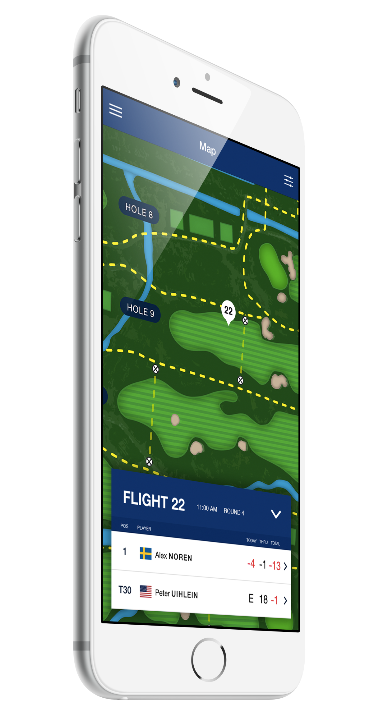
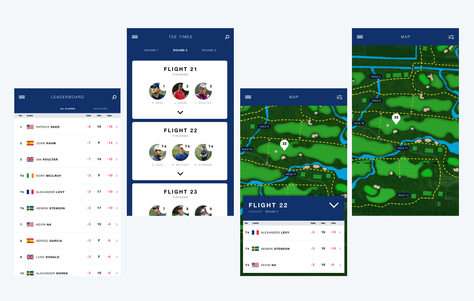
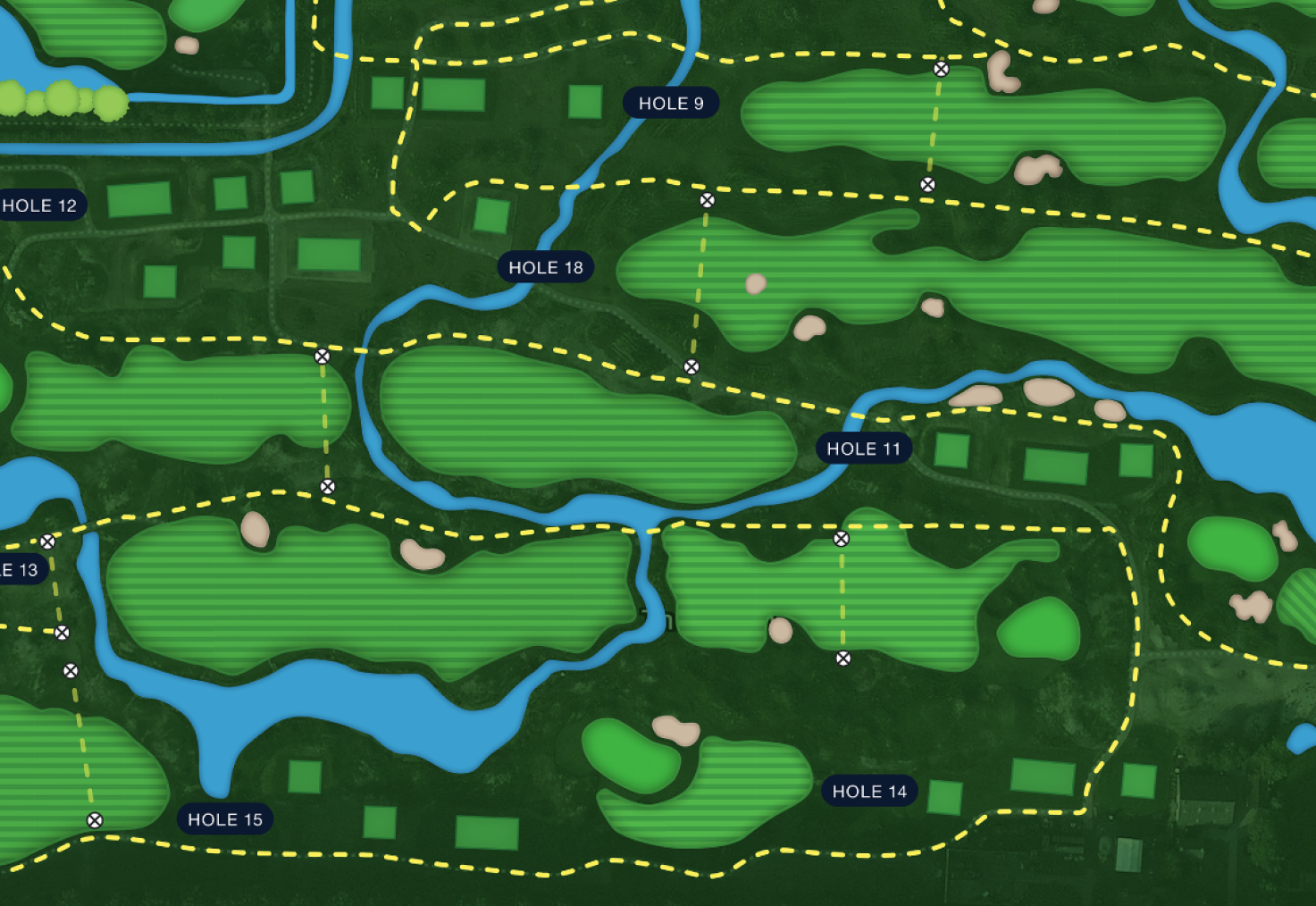
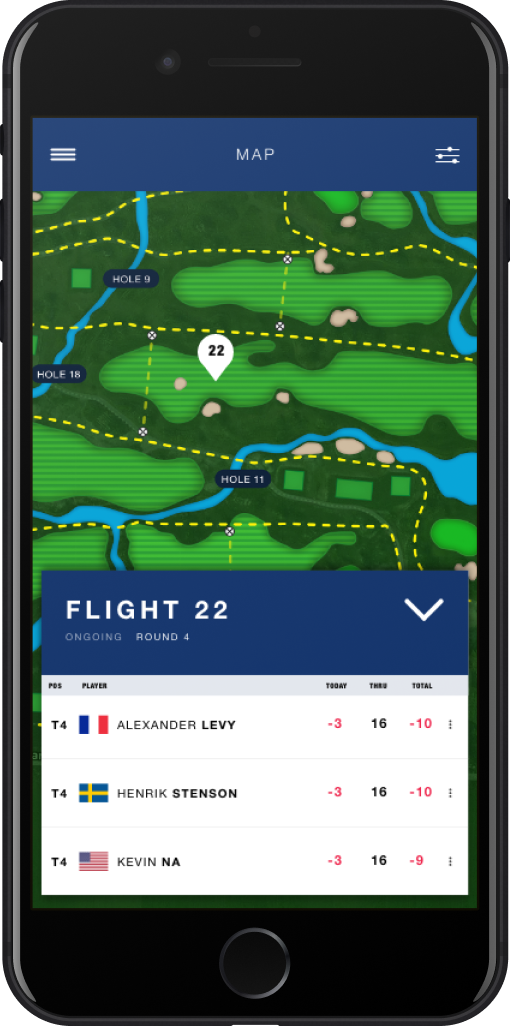
A more reliable and visually pleasing map
A more visually pleasing and better functioning map that provides a more reliable user experience for the end-user.
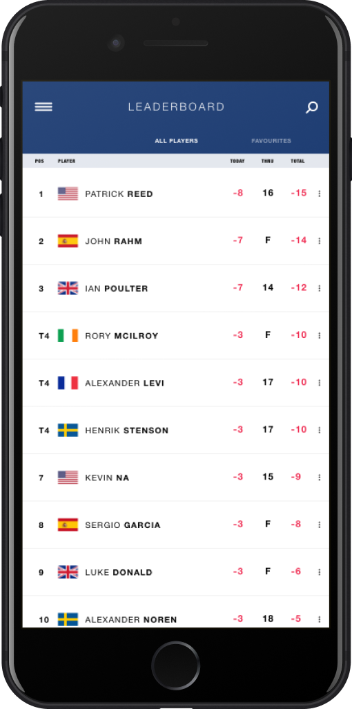
Improved leaderboard
Less cluttered leaderboard to easier get an overview. Separated favorite section to always be able to view your favorite players.
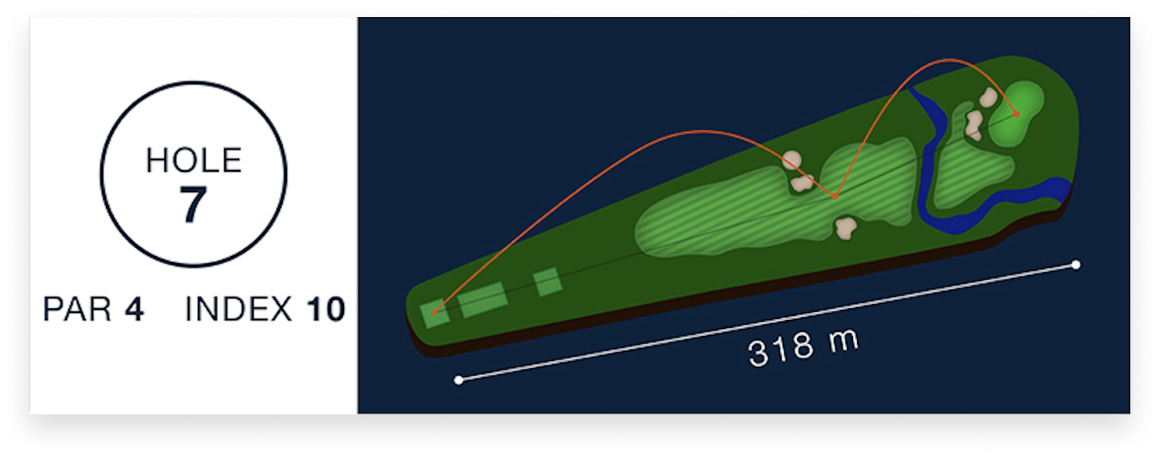
Individual hole illustrations
An easy way for the users to see what a specific hole looks like and how a professional player would play it. Especially good for the users who aren’t that familiar with the game.
More relevant info in the map view
More relevant information about each player group available directly from the map view. Here a user can easily get a glimpse of where the player is located on the course and on the leaderboard.

