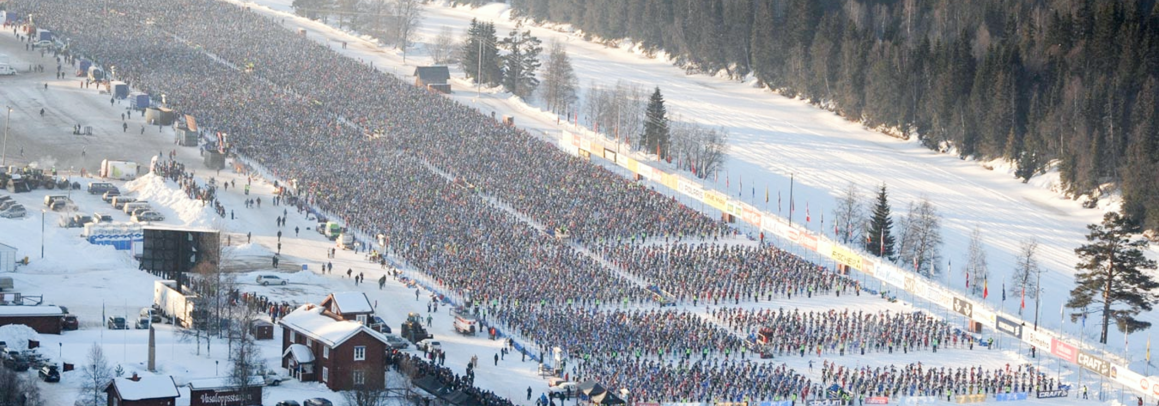
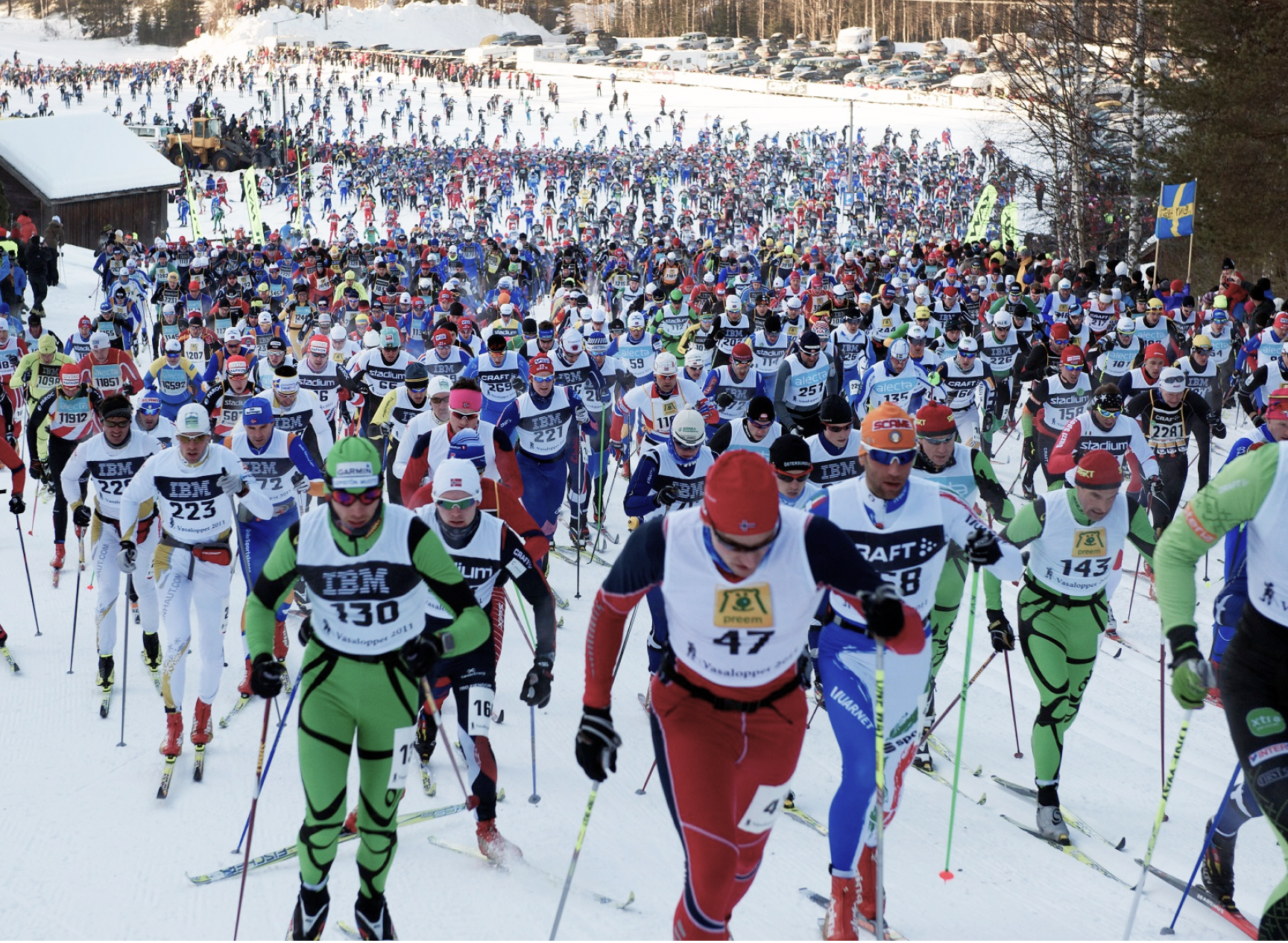
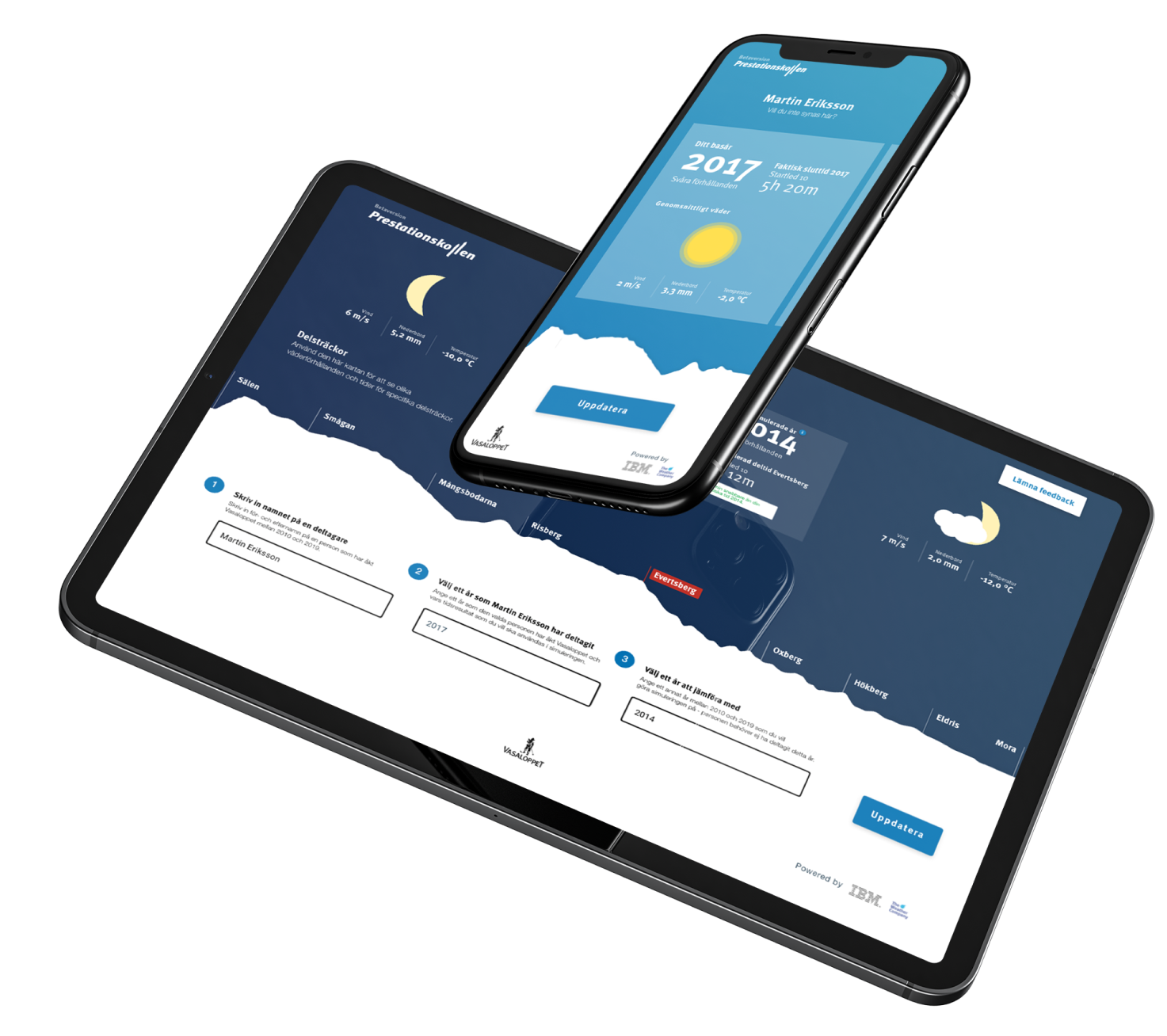
Vasaloppet is one of the biggest cross-country ski races in the world with over 20 000 participants each year. They wanted an application that would help participants compare their results between different years.
Our objective was to create a unique & visually pleasing user experience – taking an application that is pretty data-heavy and making it more fun for the user. Everything is based on the needs of Vasaloppet’s real users.
Project details
Client
Vasaloppet
My role
Product designer
The team
Front-end developers
Back-end developers
Project manager
Data scientists
Product owner (Client side)
Timeline
January 2019 – March 2019
My responsibilities
As the Product Designer on the team, my main responsibility was to make sure we understood what needed to be created to fulfill the user needs as well as the expectations from Vasaloppet.
My main tasks were to plan and facilitate a design thinking workshop to understand the users and to prioritize an MVP solution, sketching ideas and testing them, prototyping, and in the end, deliver final UI specs to the developers.
During the development process, my role was to help the team in all design-related decisions as well as creating and fine-tuning all the animations going into the solution.
The users
Who did we design for?
Prestationkollen was designed for all participants of Vasaloppet. Especially participants who are result-oriented and interested in the statistics of the race.
The problem
What was the main problem we tried to solve?
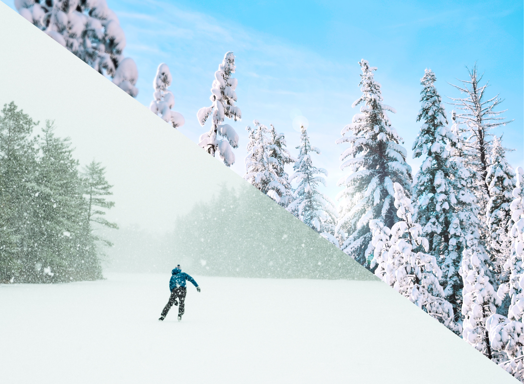
An outdoor event such as Vasaloppet is so dependent on natural elements such as wind, temperature, and precipitation.
When participants then try to compare their results to others of a different year it results in very skewed comparisons.
We wanted to create a solution that took these natural variables into account to predict what their time for one year would have been a different year.
Challenges & Constraints
Challenges
– Just one day for the design thinking workshop
– Limited time for designing & building the app
– Making a data-heavy solution fun and engaging
Technical constraints
– Responsive website
– No weather data before 1992
– Lottie animations and its restrictions
The Design Process
STEP 1
Understanding the users
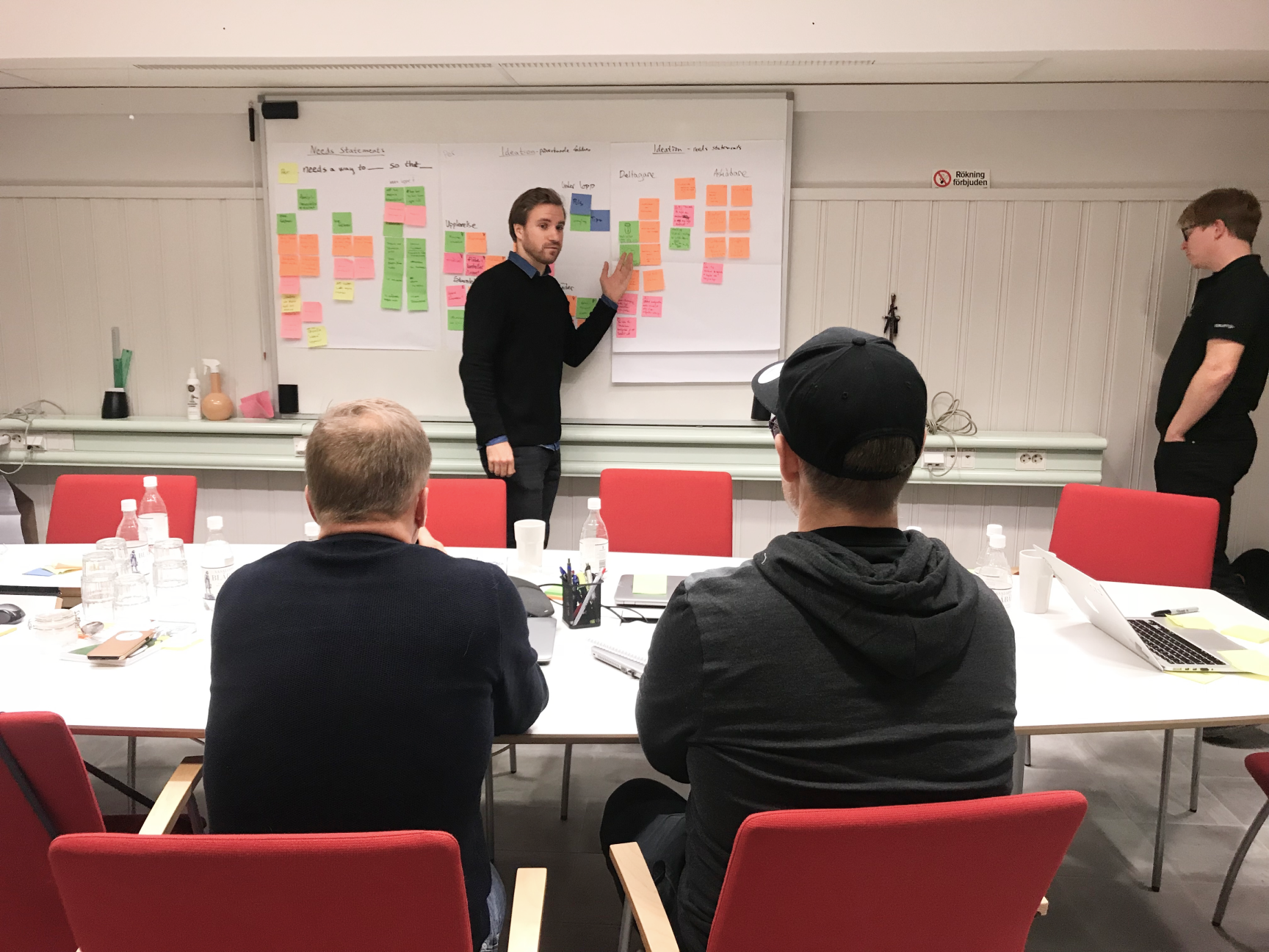
Due to client restrictions, we only had one day for our design thinking workshop that we usually put three days into.
So, the first thing I had to do was to modify and prioritize which exercises we needed to go through to have a satisfying result at the end of the day and have something that we could start working with.
Focusing on understanding the users and their pain points today helped us sketch down ideas and concepts. This then was structured in things a user could do in the solution which we then prioritized in an experience-based roadmap.
At the end of the day, we had an outline of the most critical things the users should be able to do in the MVP of the solution.
STEP 2
Sketching and conceptualizing
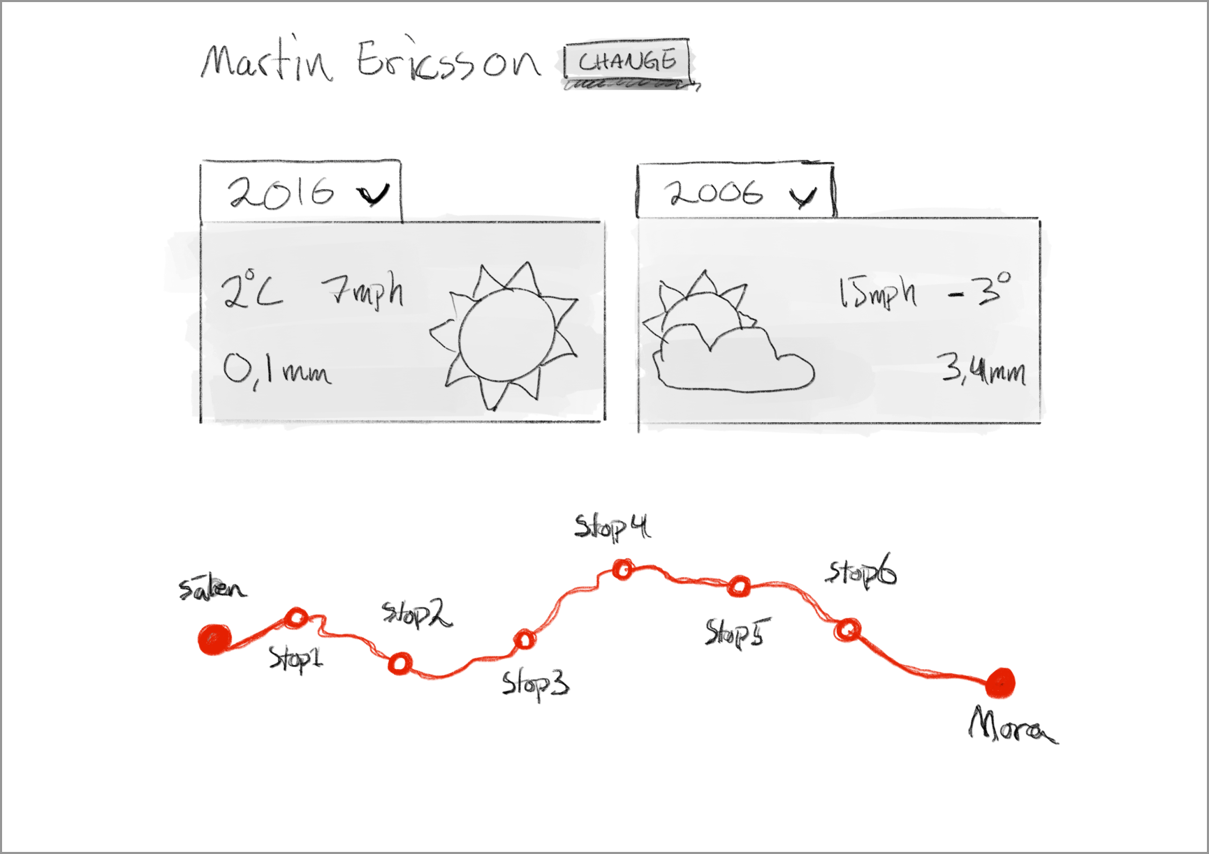
In this stage, we focused a lot on how to make the experience more fun and engaging than just showing a table of times and conditions. When it comes down to it the whole solution consisted of just race times and weather conditions.
This resulted in these conclusions:
– Use animations to make it more fun and engaging
– Have the race track (a visual identity of the race) as the main interactive navigation.
– Make it as simple as possible – focus on visuals rather than numbers and figures.
STEP 3
Prototyping
After sketching I took our new ideas and created a high-fidelity interactive prototype to show the interactions and the visual identity of the solution.
I also created some first drafts of weather animations to get the whole look and feel across to the client and the rest of the team.
STEP 4
Testing with user -> Re-design
We took our prototype and tested it on some potential users and one of the most important feedback we got was:
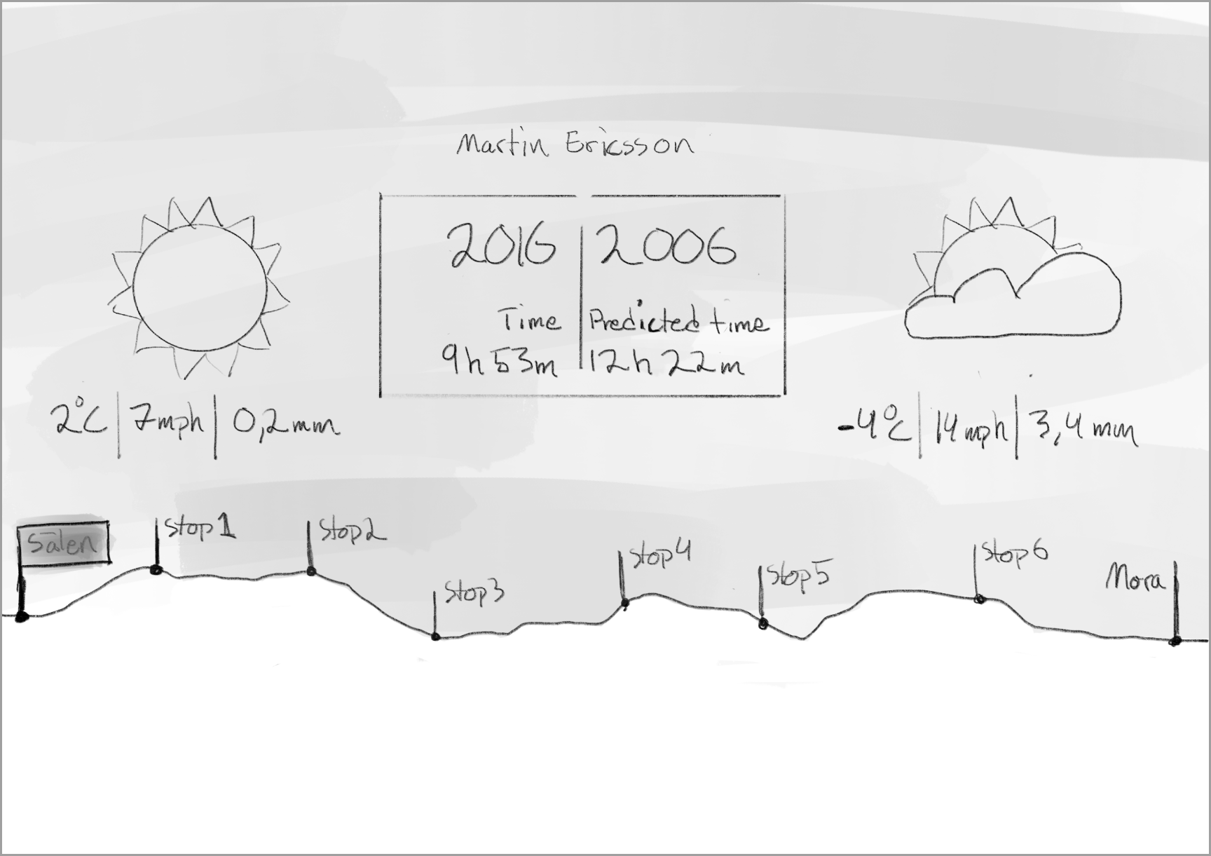
“Information about race-track elevation would be useful to have”
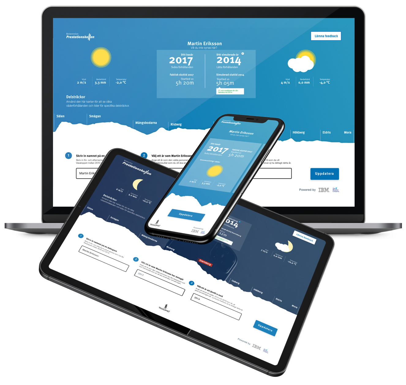
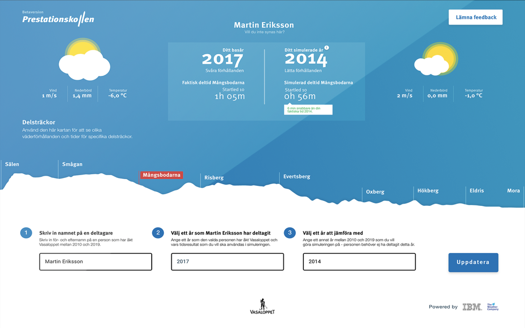
This resulted in me doing a complete re-design of the prototype. Changing the point of view of the navigational race-track from above to the side. This meant that the user could see the elevation changes on the track and we could use the top part of the screen as the actual sky to show the weather animations. It made so much more sense!
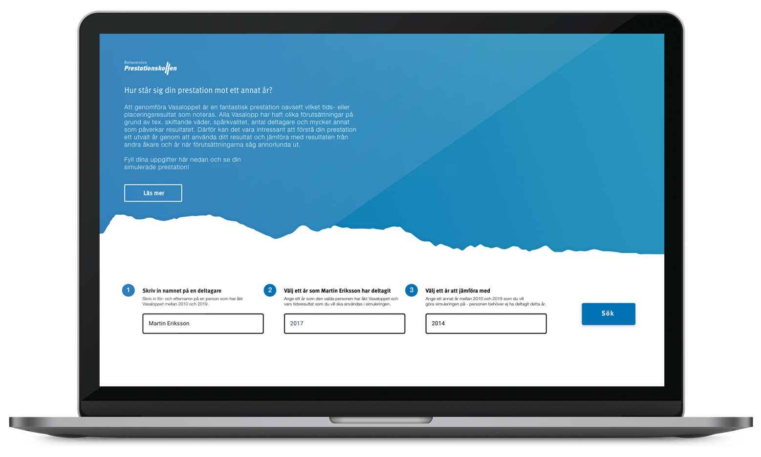
This also resulted in us being able to have this whole application as a one-page solution which was great.
STEP 5
Design spec and developer hand-off
After this re-design, I could finally hand-over the design to the developers. I used Zeplin to do this in order to make it as convenient as possible for the developers. I also exported some first drafts of lottie animations for them to be able to test with.
I worked closely with the developers throughout the building process and supported them in all design-related decisions as well.
STEP 6
Animation
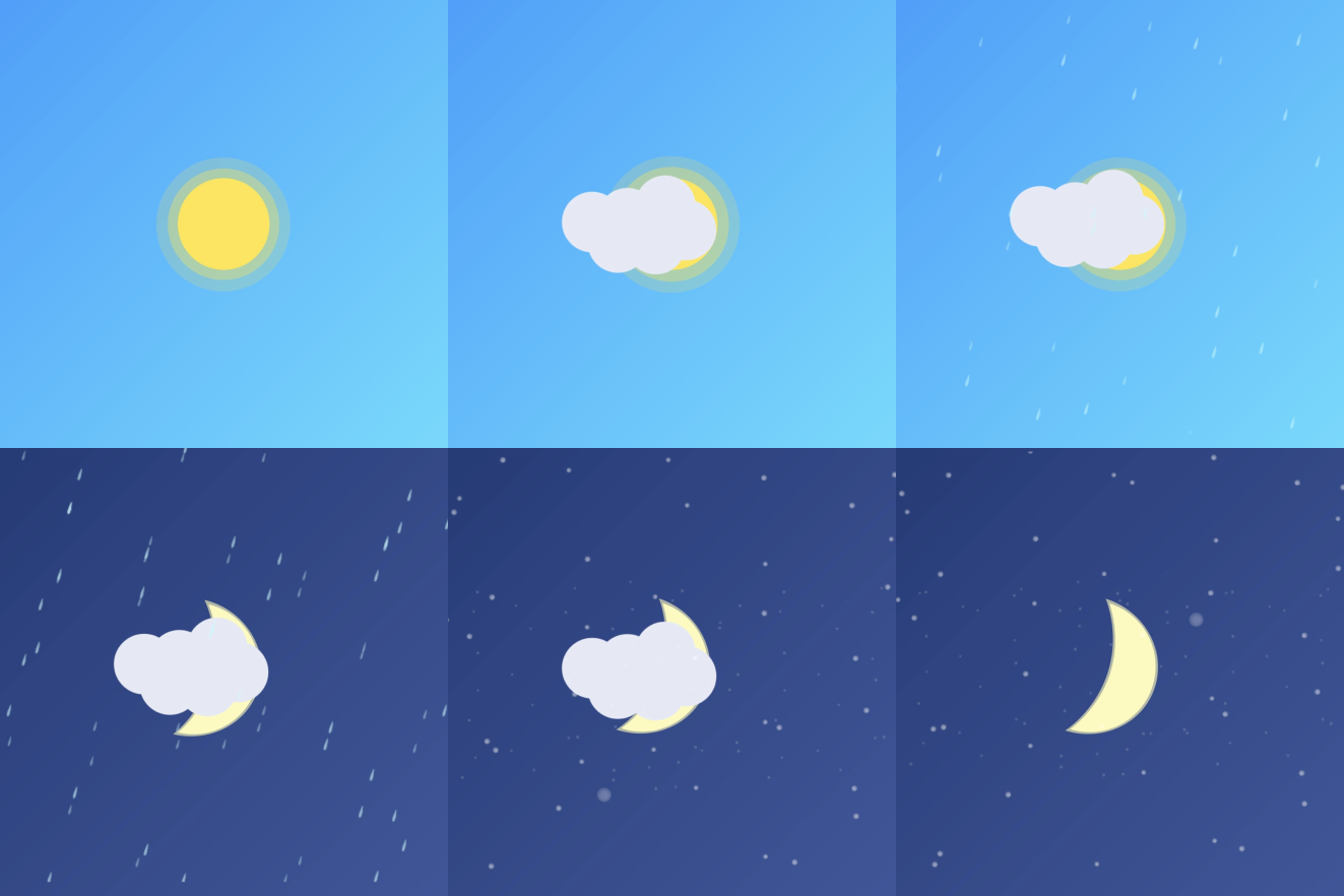
After the design was handed off I started to create all the different weather animations that needed to be available to cover all scenarios. I created them in After effects and exported them as Lottie animations that could be implemented in the code by the dev team.
A lot of time went into making all animations loop seamlessly and making them as small and compressed as possible to save computer power in the final solution.
The result
Eight weeks after our initial Design Thinking workshop with the client we had a working responsive website shipped to all participants of Vasaloppet 2019 and previous years.
It was released as a beta version and we added a feedback button to the solution where users could share their feedback in order for us to create an even better solution going forward.
One-page solution
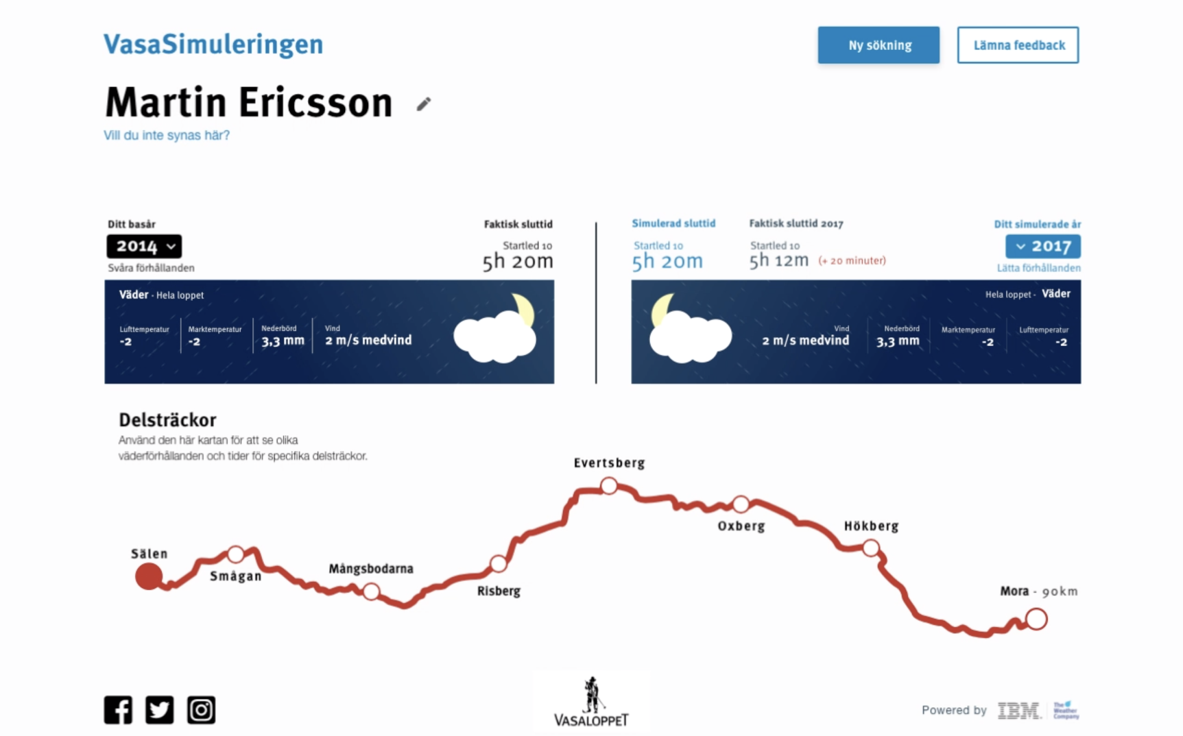
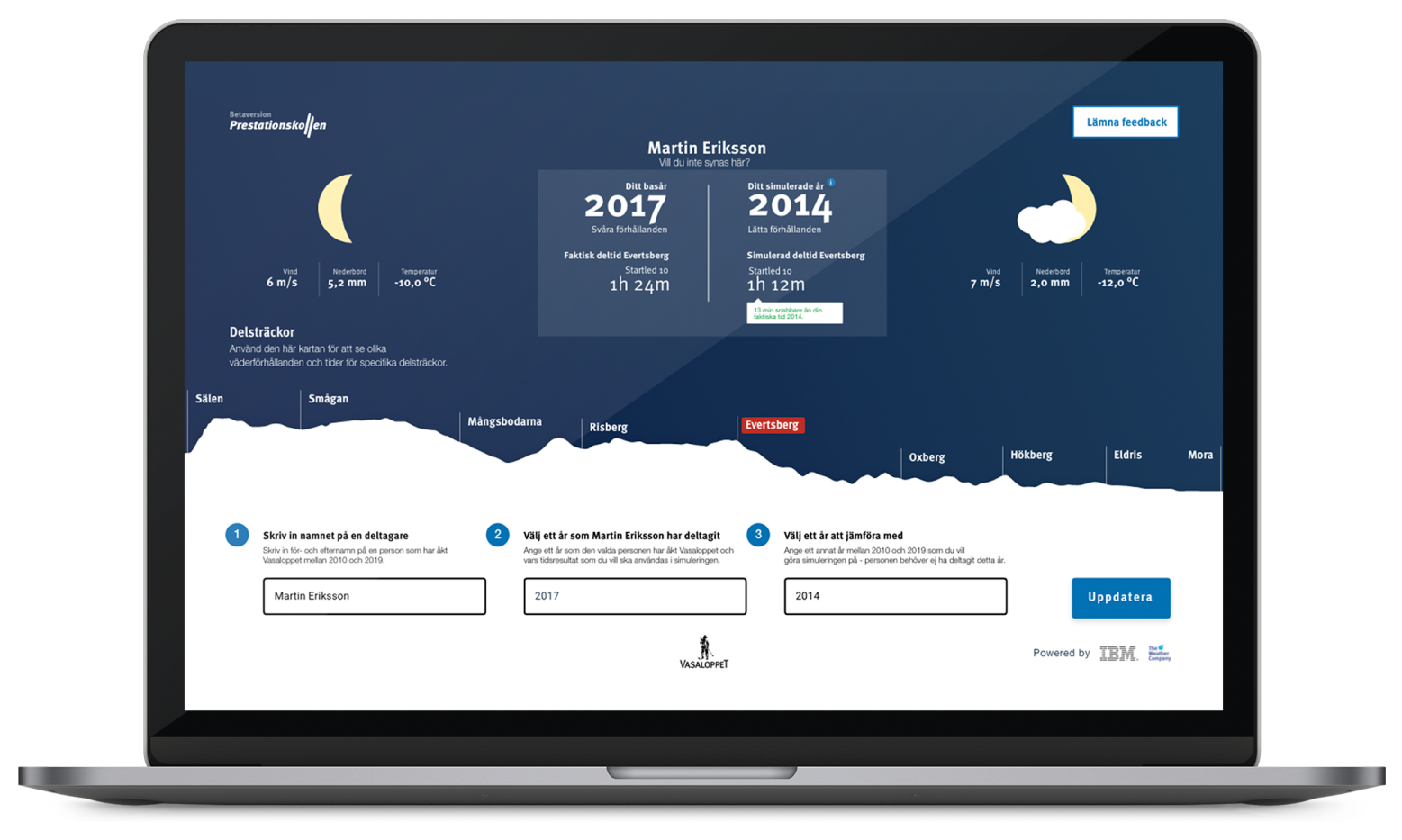
With the new design, we were able to make it into a one-page solution that made it easier to navigate. We also got a more natural way of showing the weather data and for the users to see the elevation changes.
Weather animations
One of the problems we were trying to solve in the beginning was how to make this kind of solution more fun and engaging. Creating animations was a big part of that. Initially, the weather animations were supposed to cover the whole “sky” part of the screen but due to technical & time restrictions, we had to reduce it to a smaller square.
Interactive navigation
Instead of going for a more traditional way of showing the finishing result and partway results, we went for a more visual and interactive design. This made it visually more pleasing and enjoyable to use as well as more intuitive for the users.
Responsive solution
Due to it being a website one important thing was of course responsiveness. It was something we thought about from the first sketch and we had to prioritize what functionalities had to be in a mobile version and what could be left out.

