According to Interpol, the value of the world’s illegal logging amounts to USD 100 billion per year.
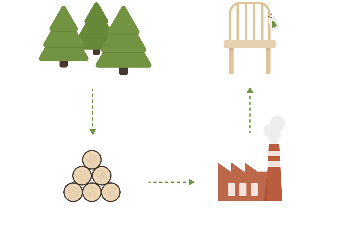
With Tracy of Sweden’s solution, you get complete traceability of the forest flow, from the individual stump to the end customer.
So the question for us was how we can improve the tree identification and tracking experience for lumberjacks and sawmill operators?
Project details
Client
Tracy of Sweden
My role
Design Lead
The team
Front-end developers
Back-end developers
Project manager
Product owner (Client side)
Timeline
September 2018 – December 2018
My responsibilities
As the only designer on the team, my main responsibility was to make sure the user experience we delivered to the client was outstanding.
Doing field studies and user-testing made it clear on what needed to change in the application and what new features had to be added in order to achieve our user goals.
I created new user flows and wireframes based on these new insights and then translated that into a high-fidelity prototype.
When the project went into the development stage my role as the design lead was to support the front-end developers in any design-related decisions.
The users
Who are we designing for?
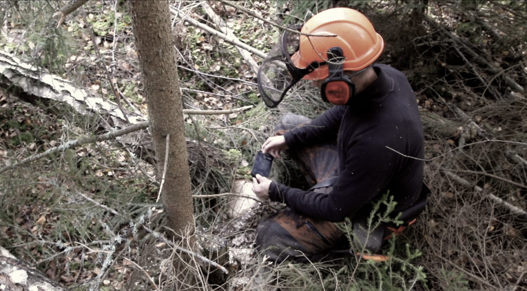
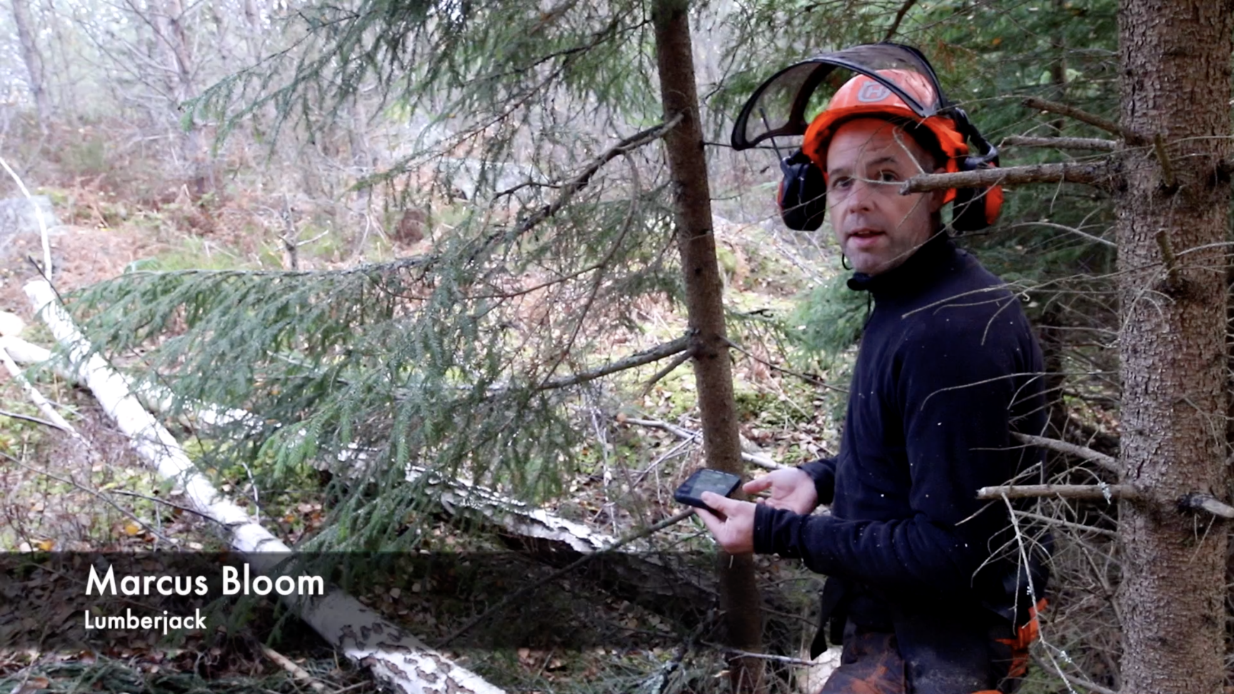
Our primary user was the lumberjack. They are working in the forests and need a simple digital way to register each tree and its logs.
Our secondary user was the sawmill operator. They needed a way of identifying the logs delivered to them.
In some cases, the users could have the combined needs of both the primary and the secondary users. We called them the super users.
The problem
To prevent illegal logging, lumberjacks are required to document and trace each individual tree and provide that to the sawmill. These additional tasks have been done with pen and paper and are not only time-consuming – it’s also difficult for the sawmills to validate the information.
So our initial question was: How can we improve the tree identification and tracking experience (i.e. the process a tree goes through from origin to being cut down to sawmill processing)?
A first MVP / Proof of concept had already been built but did not fulfill all the necessary user needs to ship.
What had to change and what new features had to be implemented to fulfill those needs?
Challenges & Constraints
Physical challenges
– Users often use gloves
– Lumberjacks work outside in various lighting conditions
– The use of Bluetooth connected devices
Technical constraints
– Often limited connection in the forest
– Application slowing down with too many simultaneous uploads and calculations.
– Big files = long upload times
– Design for robust mobile phones (CAT phones)
The Design Process
STEP 1
Understanding the users
A three-day design thinking workshop was done before my involvement in the project. From this, I got a fairly good understanding of the users and their pain points.
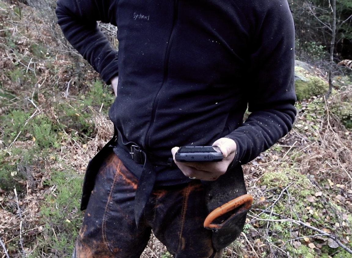
In order to gather more insights, I decided to do a field study to observe the lumberjacks using the existing application and to ask them questions during the whole process.
The key learnings I got from this field study was:
– The UI needs to be in high contrast for the lumberjacks to be able to use the app in bright daylight outdoors.
– The reception in the forest isn’t the best. This meant that we needed to figure out a way to store the data on the device until it could be uploaded to the cloud.
– They could work several hours on the same work order. Which meant they would like to pause, eg. for lunch, and then come back and continue in the same work order.
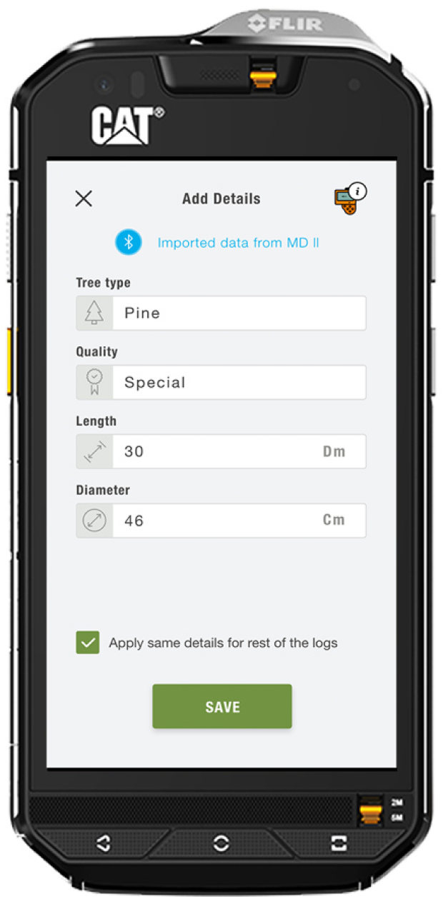
– They want to add specific details for individual logs – Manually but also with the help of a digital measuring device.
STEP 2
Re-mapping the user journey
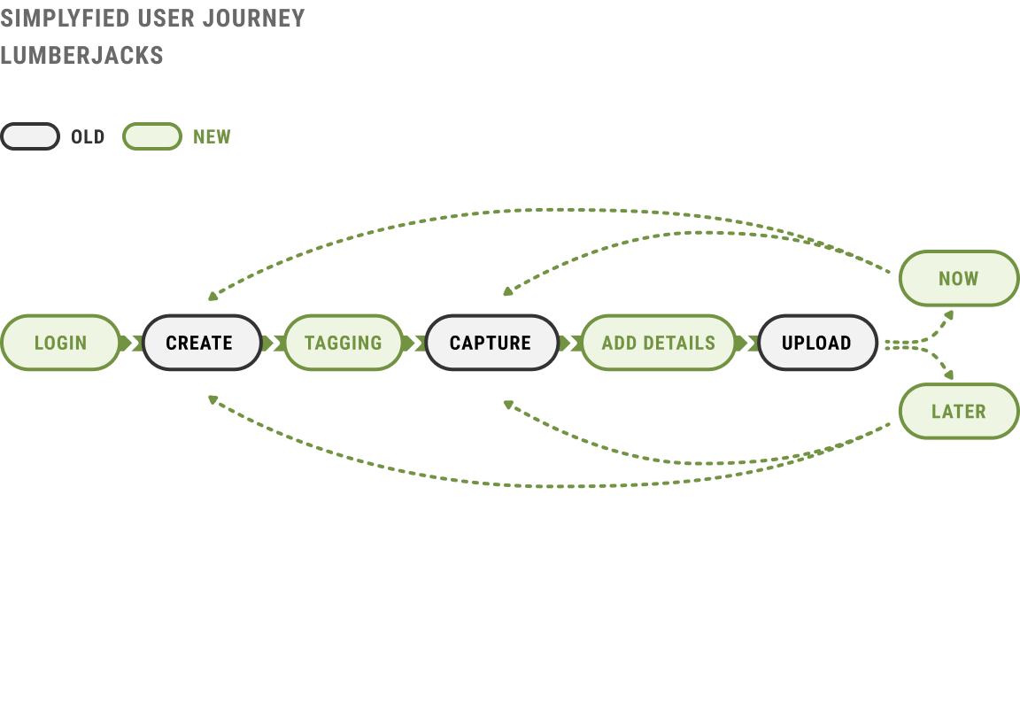
With new insights and new features added to the application, I needed to re-map the original user journey created for the first MVP.
I printed out the existing screens and mapped out the new journey by adding the new features to see how it affected the application as a whole.
These changes resulted in a new user flow where the main new feaures were:
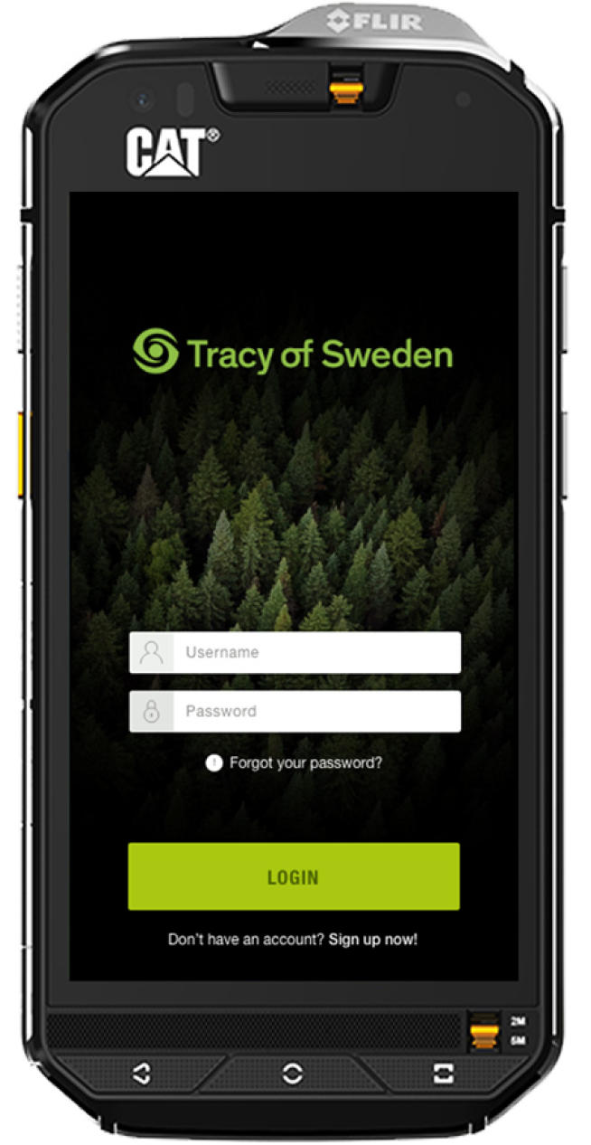
– Log-in / Sign-up flow
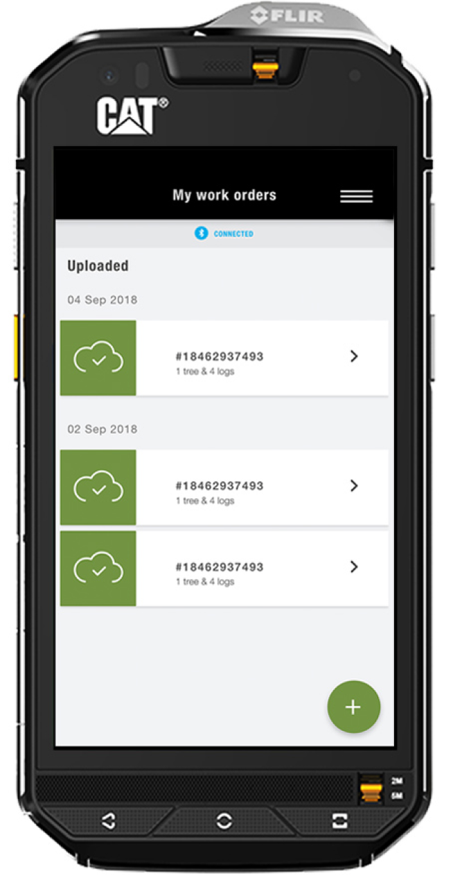
– A new way of handling work orders – pause & continue
– Device pairing through Bluetooth
– Possibility to upload images later
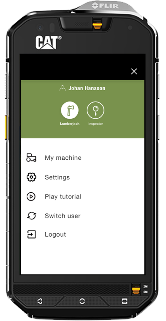
– Switch between user groups
STEP 3
Sketching
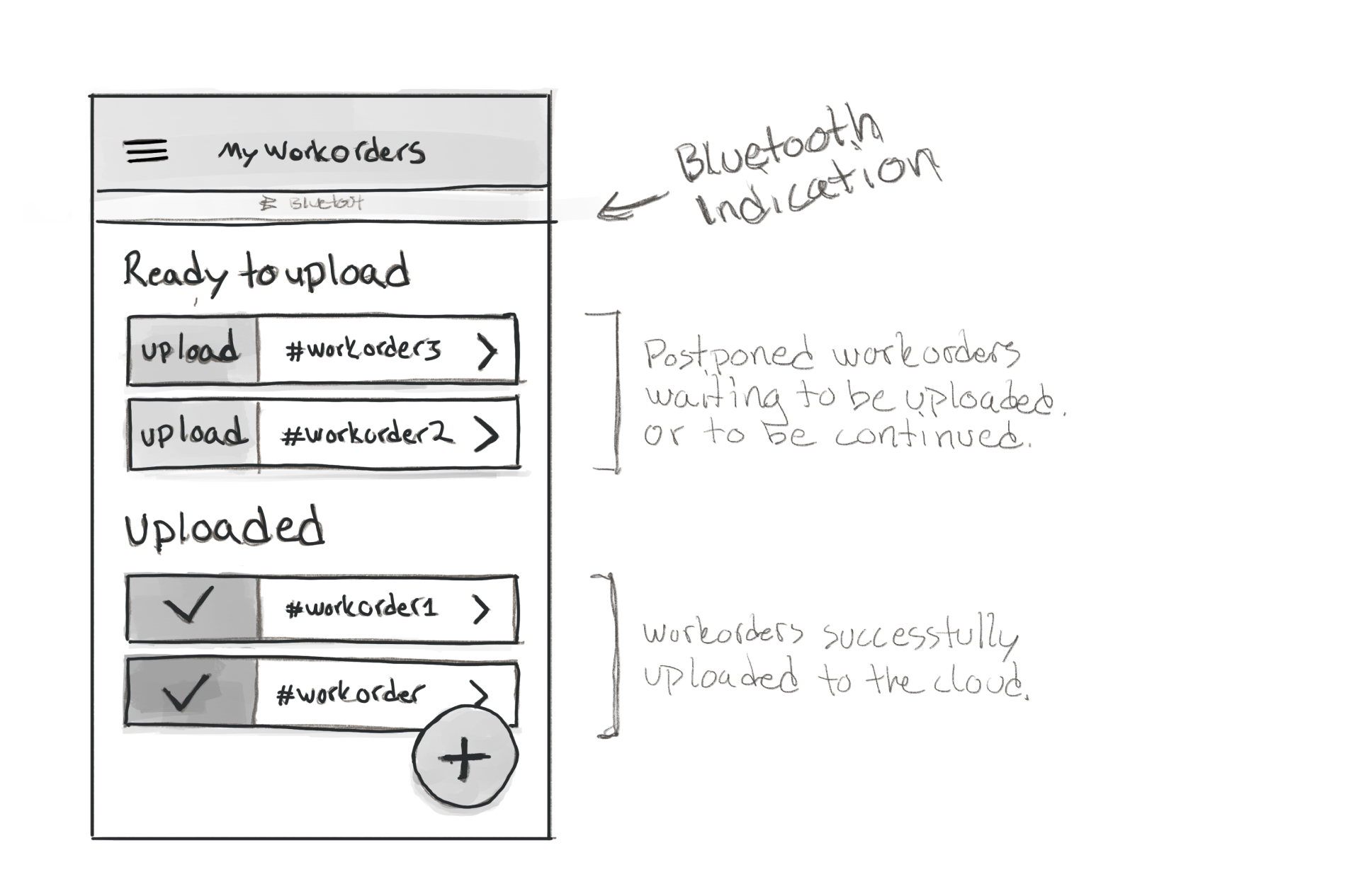
After learning more about the users, their workflow, and their needs we started sketching out some ideas for the new UI.
Some of the main features we sketched for the lumberjack were:
– A more advanced view of your work orders – ongoing and completed.
– Pairing a digital measuring device
– Possibility to Upload later
– Add details to each individual log
STEP 4
Prototyping
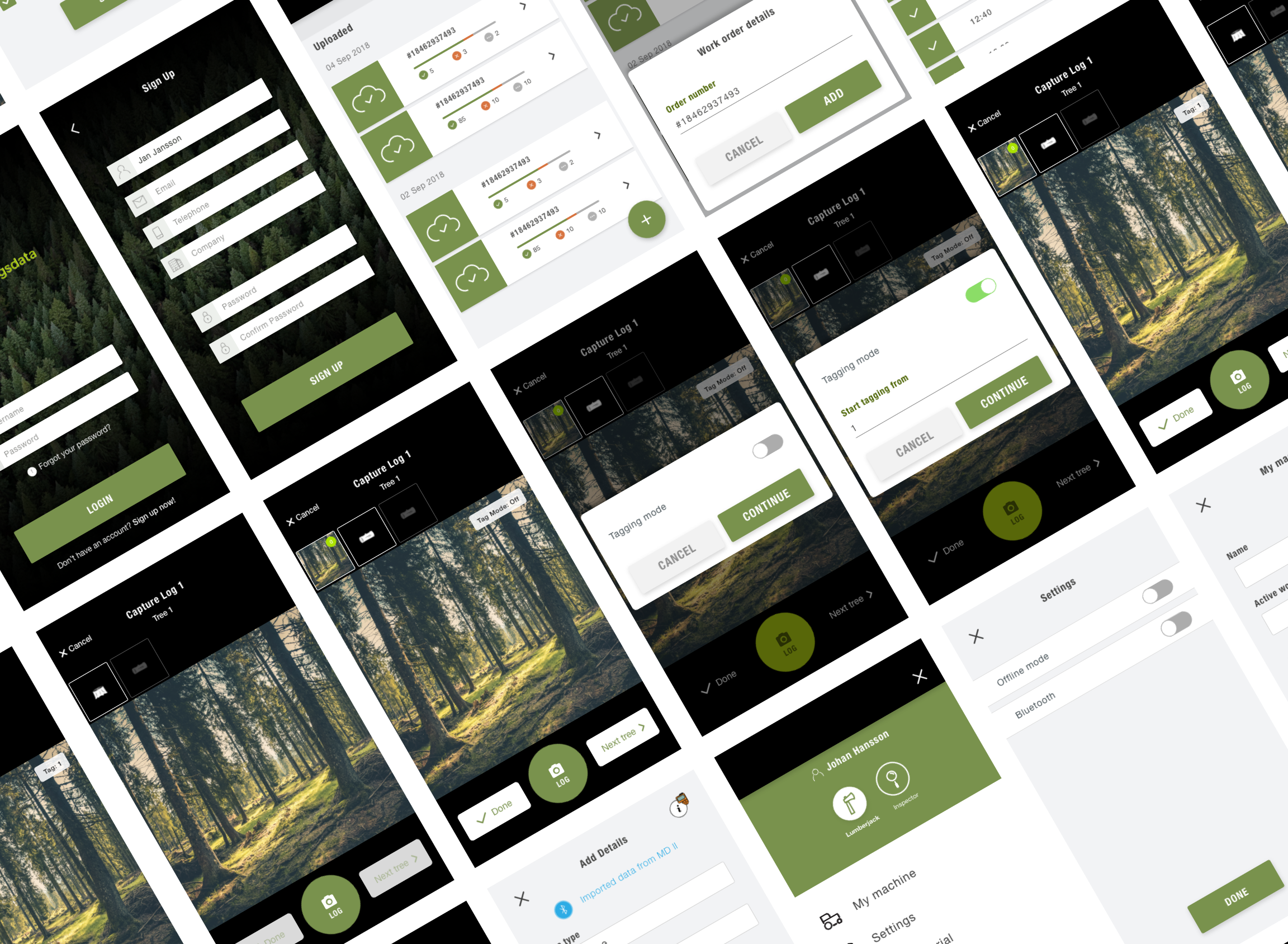
After sketching I took our new ideas and created a high-fidelity interactive prototype. This helped us test the new user flows and gave me the opportunity to look into the visual appearance of the application.
Main outcomes in this phase:
– New primary palette with better color contrasts. The original primary color provided way less contrast than you would like in a sunny outdoors environment.
– New cohesive iconography for the whole application.
– Ability to test new interactions.
STEP 5
Testing with users
To better understand if our prototyped solution could work for the lumberjacks we did a small task oriented test with a few users.
The main learnings from these tests were:
– Loading indicators is needed when uploading images.
– Bigger and more clear buttons in the capturing process.
– Possibility to have it in landscape mode during the capturing process.
STEP 6
Design spec. and developer hand off
After updating the designs based on the learnings we got from the user tests it was time to hand the design over to the developers.
Working in a tight agile team they had already been a part of the process since the beginning. So there was no big news for them.
I created the final prototype in Adobe XD. We used Zeplin to make the handover between design and developers easier. That was our source of truth for all design assets such as colors, fonts, and icons in one easy-to-use document.
I then had a supporting role for the front-end developers throughout the rest of the project helping them with all design-related problems.
The result
At the end of this project, we had a solution that was available on the Google Play Store and Tracy of Sweden could now have their first paying customers. The lumberjacks are now able to register all individual logs during the deforestation and the sawmills can now be sure that the logs they receive have been legally harvested. Everything was done in just 12 weeks.
Signup & Login
To achieve transparency, the possibility for users to switch between different kind of accounts a signup and login flow was important. This was also crucial for Tracy of Sweden for billing purposes towards their clients.
Pairing with measuring device
This was a really important feature requested directly from the users during the research phase. With this functionality the lumberjacks don’t have to input details for each log manually.
New way of handling work orders
With hundreds of images being captured during a single session, the users needed a way to wait to upload those until they had good reception or Wi-Fi connection.
Switch between roles
The possibility to easily switch between roles in the app was something requested from the users early on.

